I think up close the last one shows how well your drawings segue with your design work, even tho I like the idea of putting the window behind the figure--it sorta gives the image more imagination...What font are you using for the text?
Thanks for the feedback.. I think I used DIN.
Hello!I prefer the last one in the circle.It reminds me a bit of a norman rockwell kind of feel!Very nice drawings!
Nice designs Elizabeth.


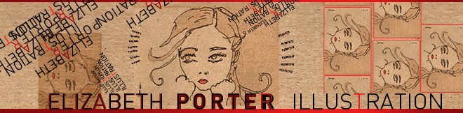
I think up close the last one shows how well your drawings segue with your design work, even tho I like the idea of putting the window behind the figure--it sorta gives the image more imagination...
ReplyDeleteWhat font are you using for the text?
Thanks for the feedback.. I think I used DIN.
ReplyDeleteHello!
ReplyDeleteI prefer the last one in the circle.
It reminds me a bit of a norman rockwell kind of feel!
Very nice drawings!
Nice designs Elizabeth.
ReplyDelete